Content fill html screen height
Problem Description
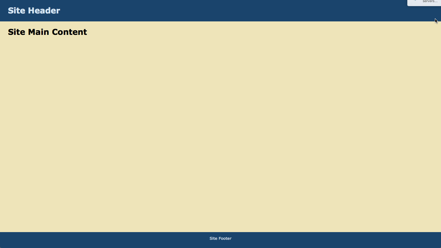
While I was trying to fit html content of page to full height of the screen using CSS, there was a lot of empty space in the content section and vertical scrollbars were appearing for no reason. Removing these vertical scrollbars and fitting the screen vertically was not as trivial as one would imagine it to be.
Problem Source
The source of the problem is the use of 100% height for the main div tag while a fixed height for the header and footer divs is used. This problem can be seen in the code below (both html and css are included). The height of the header and footer is added to the body tag, making the content go below the end of the screen and thus rendering the vertical scrollbars.
|
1 2 3 4 5 6 7 8 9 10 11 12 13 14 15 16 17 18 19 20 21 22 23 24 25 26 27 28 29 30 31 32 33 34 35 36 37 38 39 40 41 42 43 44 45 46 47 48 49 50 51 52 53 54 55 56 57 58 |
<!doctype html> <html> <head> <meta charset="UTF-8"> <style> html, body { height: 100%; width: 100%; margin: 0; padding: 0; border: 0; } h1 { padding: 0; margin: 0; } body {background: #FFFFFF; font: 13px/15px Verdana, Arial,Helvetica,sans-serif;} #header { height: 70px; text-align: left; background: #1A446C; color: #D4E6F4; } #header h1 { padding: 1em; } #main { height: 100%; background: #EEE4B9; padding: 2em; } #footer { height: 2em; padding: 1em; text-align: center; background: #1A446C; color: #D4E6F4; } </style> <title>HTML Fill Height</title> </head> <body> <div id="header"> <h1>Site Header</h1> </div> <div id="main"> <h1>Site Main Content</h1> </div> <div id="footer"> Site Footer </div> </body> </html> |
Problem Solution
There are a lot of solutions for this problem out there on the web. However, I was not able to find a direct solution to this problem. The approach I adopted in order to tackle this problem is using flex. The approach is outlined in the sections below.
content id CSS
The first thing to do is to create a div tag with an id (let’s say for example: content) which contains header, main and footer div tags. The id of this div will be assigned the following properties:
|
1 2 3 4 5 6 |
#content { display: flex; flex-direction: column; min-height: 100%; height: auto; } |
The display property set to flex, this will ensure that the children will also become flexible. Next, the flex-direction property needs to be set to column since we want the content of the content container to shrink and grow in the vertical direction. The min-height property is set to 100% in order to ensure that the content always tries to fill the whole screen and the height property is set to auto in order to ensure that when the content does not fit the whole screen, the height of the container is automatically adjusted to maintain the layout. If I do not set the height property to auto then I get a strange behaviour; footer is no longer kept at the end of the main, instead it overlaps the content when the content in the main is not able to fit the screen height.
header id CSS
The only changes that need to be made for the header is to remove the height property and use flex: 0 0 70px. The first number represents flex-grow, the second flex-shrink and the third flex-basis. Basically, we do not want this content to grow or shrink but remain a defined size. More details regarding these properties are provided here.
|
1 2 3 4 5 6 |
#header { flex: 0 0 70px; text-align: left; background: #1A446C; color: #D4E6F4; } |
main id css
The only change for the main id is the same as for the header id except that we do want this content to grow and shrink and flex-basis to be auto.
|
1 2 3 4 5 |
#main { flex: 1 1 auto; background: #EEE4B9; padding: 2em; } |
footer id css
The only change for the footer id is the same as for the header id except that the flex-basis property is 2em. Again we do not want this content to shrink or grow.
|
1 2 3 4 5 6 7 |
#footer { flex: 0 0 2em; padding: 1em; text-align: center; background: #1A446C; color: #D4E6F4; } |
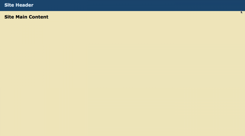
The html file containing the correct CSS for making sure that the main content grows properly to fill the height of the screen without vertical scroll bars is given in the snippet below. A screenshot of the fixed page is also provided. Compare this with the title image to see the difference!
|
1 2 3 4 5 6 7 8 9 10 11 12 13 14 15 16 17 18 19 20 21 22 23 24 25 26 27 28 29 30 31 32 33 34 35 36 37 38 39 40 41 42 43 44 45 46 47 48 49 50 51 52 53 54 55 56 57 58 59 60 61 62 63 64 65 66 67 |
<!doctype html> <html> <head> <meta charset="UTF-8"> <style> html, body { height: 100%; width: 100%; margin: 0; padding: 0; border: 0; } h1 { padding: 0; margin: 0; } body {background: #FFFFFF; font: 13px/15px Verdana, Arial,Helvetica,sans-serif;} #content { display: flex; flex-direction: column; min-height: 100%; height: auto; } #header { flex: 0 0 70px; text-align: left; background: #1A446C; color: #D4E6F4; } #header h1 { padding: 1em; } #main { flex: 1 1 auto; background: #EEE4B9; padding: 2em; } #footer { flex: 0 0 2em; padding: 1em; text-align: center; background: #1A446C; color: #D4E6F4; } </style> <title>HTML Fill Height</title> </head> <body> <div id="content"> <div id="header"> <h1>Site Header</h1> </div> <div id="main"> <h1>Site Main Content</h1> </div> <div id="footer"> Site Footer </div> </div> </body> </html> |